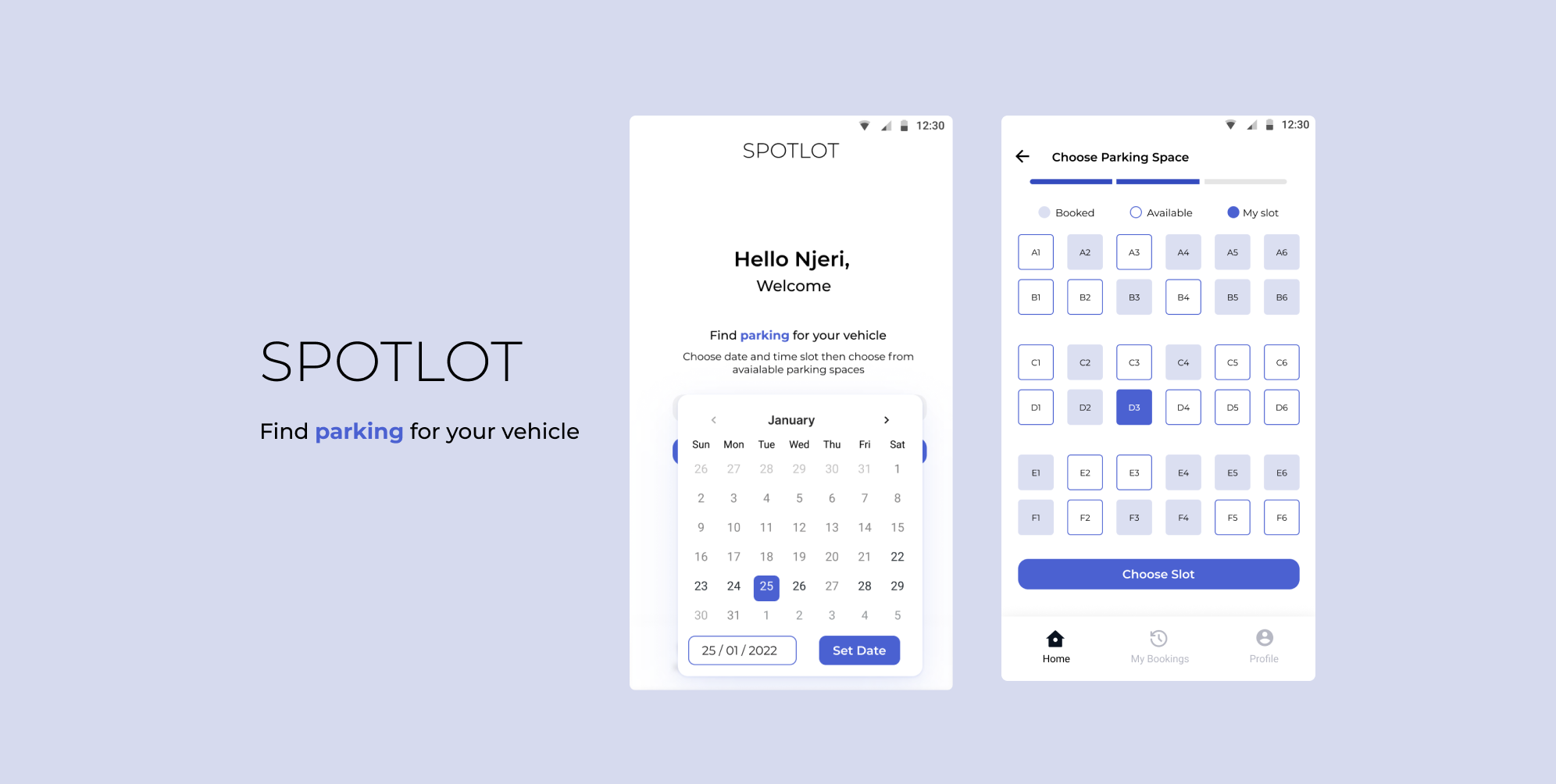
The Challenge Statement
With many employees returning to work from the office fulltime and in a hybrid mode, your company is looking to you for some design expertise. Design the parking booking experience to be used by all employees seeking to park their cars in the different parking slots within the office block. Employees can check availability, book and cancel a parking slot.
The Project Goals
1. Improve employer happiness and hence talent retention.
2. Reduce time wasted at check-in, therefore more productive hours at the office.
Assesing the current solution
How do employees currently get parking? An assesment of the current solution was paramount to understanding the needs of the users.
Employees at Konza sign at the gate and the guards at the gate keep track of the parking spaces.
The Pain Points
Next, I identified the pain points within their current situation.
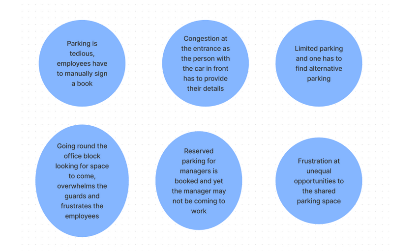
With the pain points identified, the areas in which we could innovate around to help the employees of Konza became clear.
How might we innovate around our painpoints
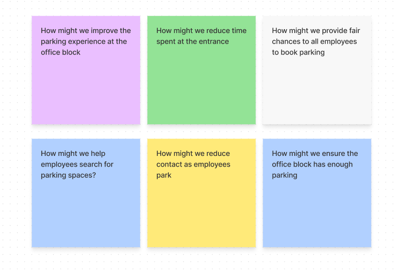
With the how might we statements, I started having ideas around how our solution could look like. I then mapped the solution journey to see if more opportunities to help the users came up.
The User Journey Map
The Solution: SpotLot
I finally settled on a mobile application called SpotLot. All employees have mobile phones and with an app, they could simply download it and start using it. Therefore no training needed for adoption.
Finally, a walk through of how the solution would be
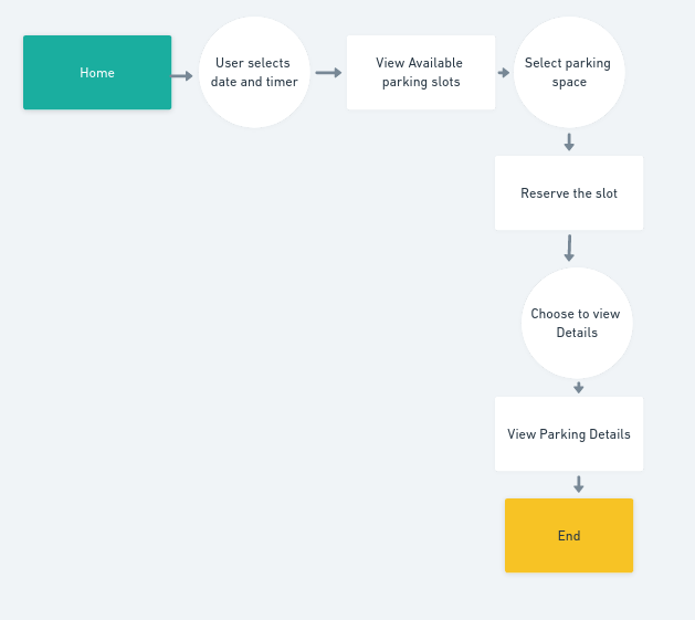
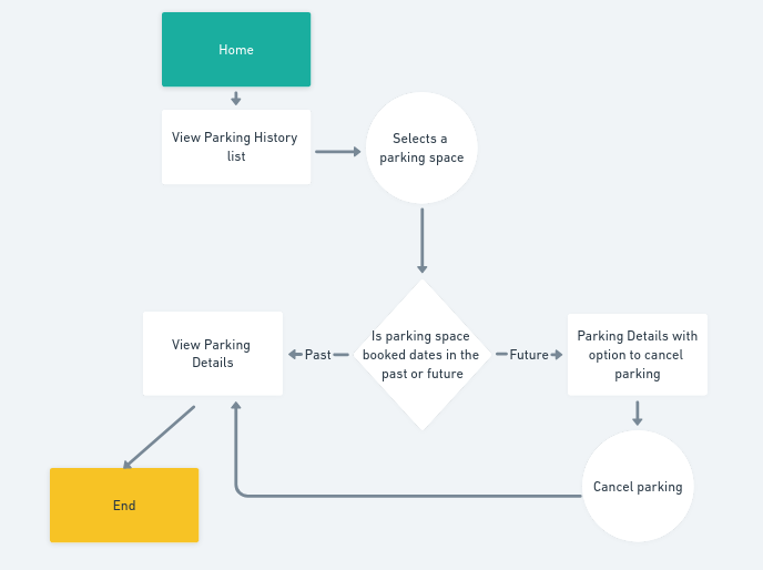
The main flows for the solution would be booking and canceling a parking spot.
With this in mind the 2 user flows are as below
The Sketching
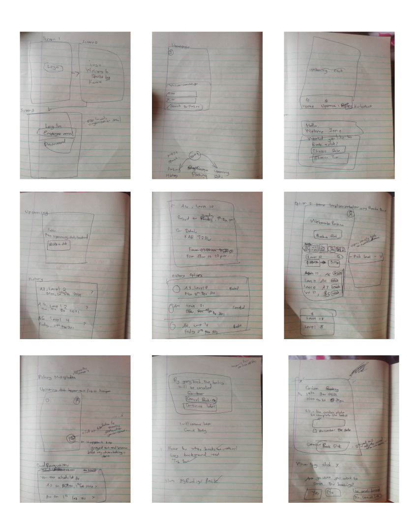
I started sketching how I envisioned the solution could look like.
I sketched on my book with a pen, and sketched different ways in which features could be implemented
Wireframing the mobile screens
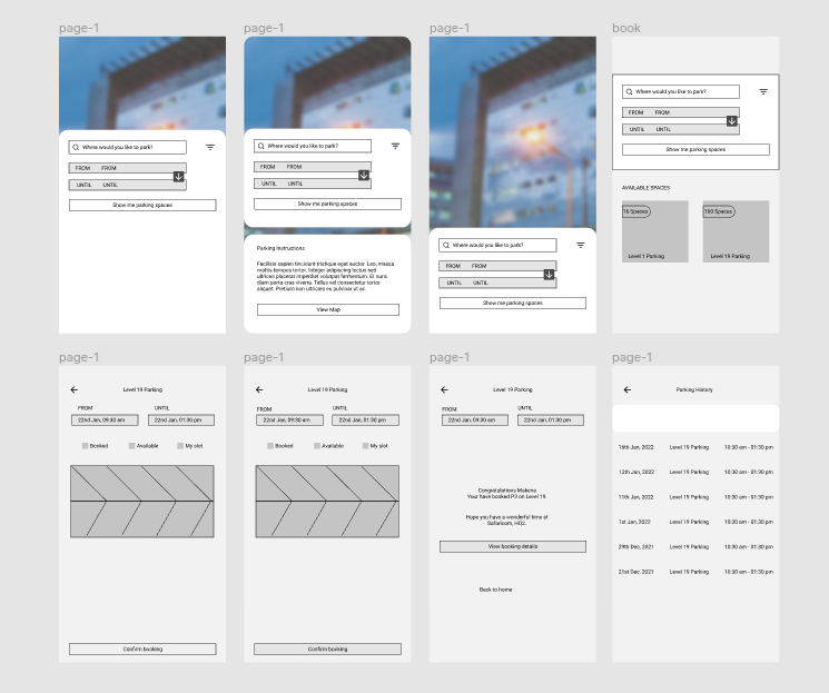
I then went on to further see how the different screens could be in a way that makes sense, this also involved a bit more sketching I then settled on the designs , after which I introduced a colour scheme and worked on refining the prototypes as seen below.
Prototyping SpotLot
The mobile app would borrow the company's color palette and use Montserrat Font.
Logging In
As this is a company project, the user is a company employee. Rather than have them create a whole new account to use the system, they could login using existing credentials. An assumption is that the companies usually have a management system they use, the same credentials can be extended for use here.
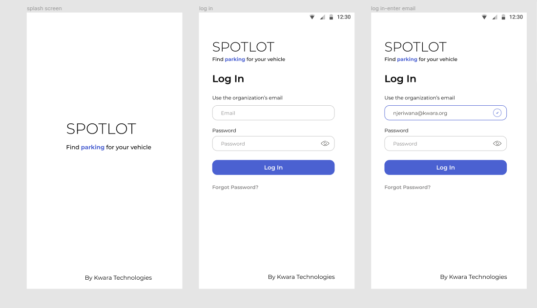
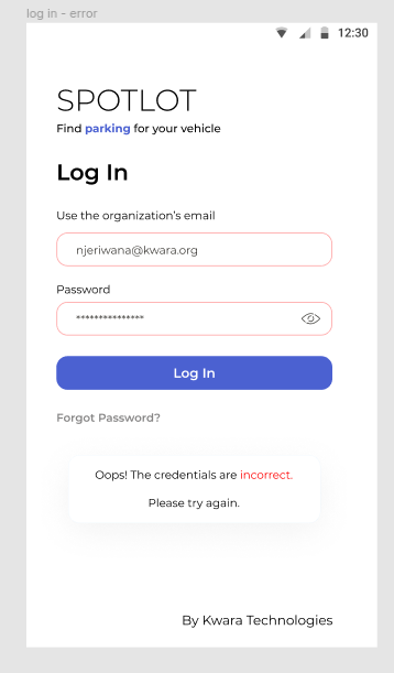
An important part about user experience is designing for error. Several errors could occur at this juncture.
For validity of emails, an in-line indication shows that the email input is valid.
For incorrect password and email, a separate pop-up with an error message is shown. The message is thoughtful and also provides the user a way to recover from the error.
Booking a Parking spot
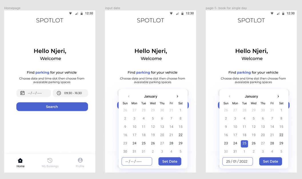
The employees search by date and time. They specify from when to when they would like to park. Possible errors here:
- Choosing an invalid date
- Choosing a date with no slots
The user is limited to what dates they can select, they can only select future dates and dates into a week in advance only. Dates that are also booked cannot be chosen.
Selecting the ideal spot and inputting vehicle details
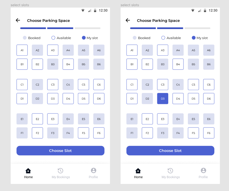
The user after clicking on search is led to a screen where they can select the parking spot and finally input the vehicle details.
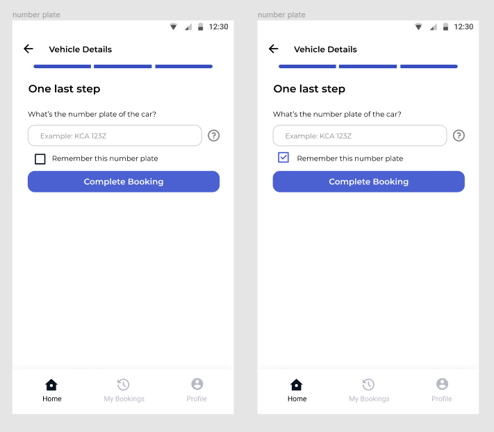
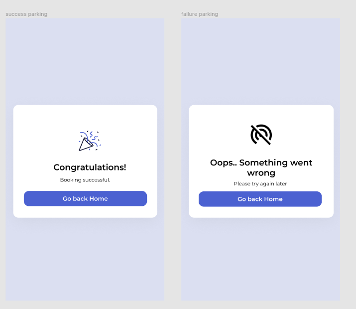
At the end, there are two scenarios, a successful booking or an unsuccessful one. The screens below cater to those two.
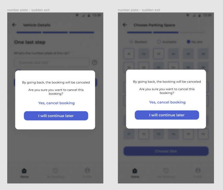
At either of these steps, a user may press on the back arrow or use motions to indicate they’re going back. When they do, they get prompted to save their progress or cancel the ongoing booking.
Cancel a Booking
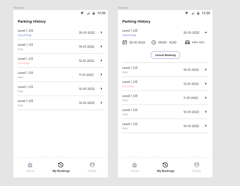
From the parking history, sorted by most recent, a user can click on an upcoming booking to view details and there is an option to cancel booking.
Measuring Success
After all is done,the designs meet user needs but testing is still important.
The following ways are the measures of success for this application:
- Measure efficiency of booking parking by the app.
- How do the employees rate their experience.
- Measure time saved by using the app instead of tthe old method.
Usabilty Testing of the Prototype
5 employees were asked to book parking as they walked me through their thoughts.
They interacted with a Figma prototype and testing was done over a Google Meet video call where they shared their screens.
Key findings
They succesfully booked and could cancel their parking spaces. I noted that the rest of the success metrics could be used to test out the app after launch to find areas of improvement.© 2022 Design and code by Easter
